
More than a refresh: the next chapter of Sleek
Over the years, Sleek has evolved alongside our clients, our team and the experiences we create together.
Our refreshed identity reflects the business we've become: more ambitious, more sophisticated and more globally connected than ever before.
But this isn't a reinvention.
It's the next chapter in a story shaped by the relationships, creativity and collaboration that have driven our growth since day one.
The new look is the result of months of thinking, testing and honest conversations about who we are now, where we're heading, and how we want Sleek to feel.
A look and feel for the next chapter
What started the refresh wasn't about changing things just because we could.
As Sleek continued to mature as a business, our team recognised that the brand didn't quite feel like Sleek anymore.
Alongside conversations around our vision, mission and values, there was an opportunity to take a step back and ask a bigger question: does our brand feel like the experience of working with Sleek today?
The answer was that there was space to move things on and create something that felt more like us. The more we talked it through, the clearer it became that the brand needed to show how Sleek has grown into a business that brings together strategy, creativity, innovation and brilliant delivery.
Finding the balance between creativity and capability
One of the biggest challenges was finding the right balance between creativity, technology and humanity.
The creative team explored multiple directions, testing colour palettes, visual styles and brand routes before arriving at the final identity. Throughout the process, we kept coming back to one question: does this feel like Sleek? It needed to feel creatively ambitious, while still feeling polished, trusted and client-ready.
Rather than positioning ourselves as purely corporate or purely lifestyle-led, we worked towards something that felt distinctly Sleek: modern, human, confident and creatively driven.
"We weren't trying to create a brand that simply looked different. We wanted to create one that felt more like Sleek. A lot of our thinking centred around people. We create experiences that have a real impact on how people feel, so it was important that the new brand felt more human, more approachable and more emotionally connected." – Yuqing Lui, Creative Lead
Connecting our values to every design decision
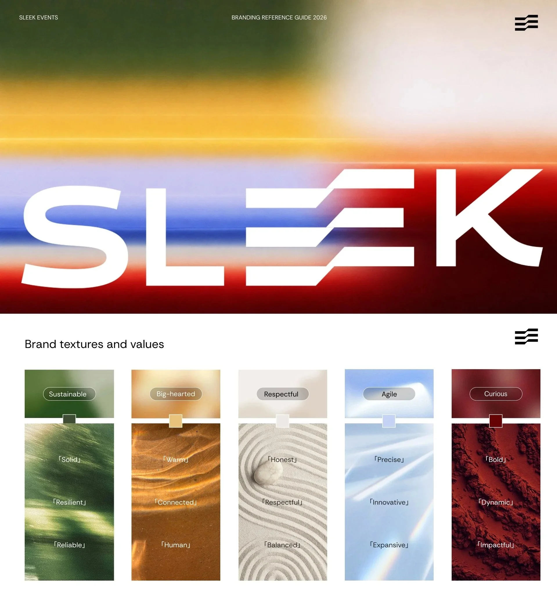
The new visual identity was never just about how things looked. Every colour within the new palette was connected back to one of Sleek's values, creating a stronger link between how the brand looks and what the business stands for.
The creative team combined design principles, colour theory and strategic thinking to create a palette that felt distinctive while reflecting attributes such as curiosity, agility, innovation and human connection.
By building our values into the way the brand looks and feels, it became more than a new set of visuals. It became a way of expressing what matters most to us as a business.
Bringing humanity into the brand
One of the biggest shifts was moving away from a visual identity that felt colder and more technology-focused towards something warmer, more human and more reflective of the experiences we create.
This inspired the introduction of textures, layered visual elements and AI-generated imagery that blend natural influences with digital creativity. The aim was to represent something central to both our work and our industry: the relationship between people and technology.
The look and feel needed to work alongside real event photography and client case studies while still creating a recognisable Sleek world of its own. The result is a brand that feels more emotive, more approachable and truer to our culture.
Designing with accessibility in mind
The rebrand was shaped by hundreds of decisions, many of which happen behind the scenes.
From typography choices and image treatments to colour contrast testing and accessibility reviews, the team carefully considered how the brand would work everywhere it needed to - from the website and socials to presentations and client work.
These details help ensure that the brand is not only recognisable, but also clear, inclusive and easy to use day to day. It's an approach that reflects the same level of care and attention to detail that goes into every event we deliver.
A showcase of creative thinking
Perhaps the most rewarding part of the project is what it says about our team.
The rebrand was developed in-house by the people who help shape experiences for our clients every day. Designers, creatives and strategists worked together to build an identity that reflects the business we are today and the ambitions we have for the future.
Along the way, the project became much more than a design exercise. It became an opportunity to explore how we tell our story and how we represent the ambition, creativity and culture that drive our business forward.
"What excited me most was seeing the brand finally catch up with the reality of who we are. People often talk about how welcoming, collaborative and creative Sleek is, and the new identity does a much better job of reflecting that. The process became much more than designing a new visual identity. It was an opportunity to explore how we tell our story and how we represent the ambition, creativity and culture that drive our business forward." – Karen Ho, Senior Designer
The project also showed just how much talent sits within Sleek's creative team. From strategy, storytelling and branding through to design, animation and implementation, the rebrand demonstrates the same thinking and attention to detail that we bring to our client work every day.
What emerged wasn't simply a refreshed look. It was a clearer expression of who we are.
More human. More connected. More reflective of our culture. And a visual identity that better represents the creative energy behind Sleek.